
T’is the Season to be Jolly
With reports that the few weeks before Christmas can, in normal times, equate to a quarter of pubs’ yearly profits, this is an important time of the year for pubs in Great Britain.
However, the impact of the pandemic and the cost of living crisis has proved to be a challenge for some pubs, causing many to close.
So with Christmas coming and revellers heading to their local pub for festive fun, we’re revisiting Stephen’s blog on how some of these locals could be affected by recent trends in the number of British pubs.

The Bull – Ambridge
We start with perhaps what is our oldest pub – built in the 16th century – “The Bull” which can be found in the sleepy rural hamlet of Ambridge, in the English Midlands.
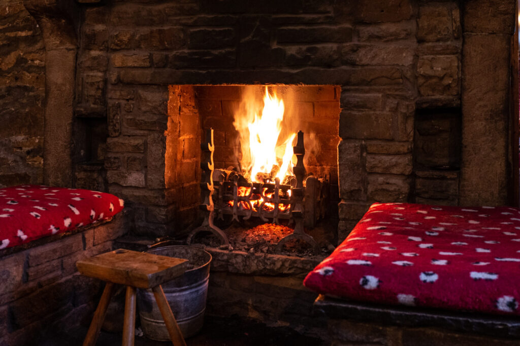
In locations like this, many pubs have unfortunately closed their doors, with nearly one in four of these ‘Prospering countryside life’ neighbourhoods witnessing a pub closure since mid-2014.
Despite this trend, not all is gloomy for such pubs. Some have garnered recognition as ‘assets of community value’ and have been successfully rescued, now operated by the local community.
The Woolpack – Emmerdale
“The Woolpack” is located in the village of Emmerdale on the fringes of the Leeds and Bradford conurbation in Yorkshire.
This pub is in a ‘Rural traits’ neighbourhood and whilst these types of neighbourhood have experienced some reductions in the number of pubs, it is to a lesser extent than some other rural neighbourhoods.
Here nearly one in five of these neighbourhoods show a reduction, by one pub on average. A potential solution to safeguarding some of these pubs involves a shift towards a greater emphasis on food, transforming into a gastro-pub. Through their convenient location, they can attract customers from nearby towns and cities to visit, thereby contributing to their sustainability.
The Vic – Walford
We now transition to a London pub known as “The Queen Victoria,” affectionately referred to locally as “The Old Vic.” Situated in the London borough of Walford in East London, this pub, constructed in 1860, has witnessed significant changes in its neighbourhood over the past 150 years.

Presently, the area falls into the category of an ‘Urban cultural mix’ neighbourhood, characterised by a diverse range of generations, ethnicities, and employment opportunities within the community.
To some extent, this area is poised for gentrification, and during the eight-year period, the number of pubs has remained relatively stable, showing a slight, albeit insignificant, reduction.
The Rovers Return – Weatherfield
Remaining in an urban setting, we now journey north to “The Rovers Return,” a traditional working-class pub nestled among cobbled streets in the inner-city suburb of Weatherfield, Manchester.
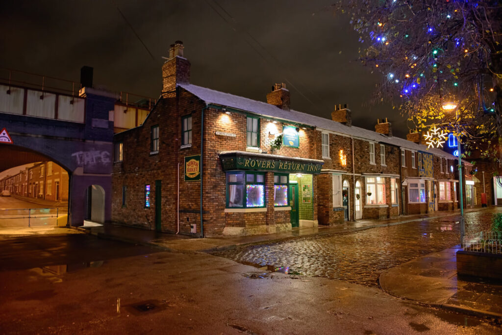
Image courtesy of Ian Middleton Duff – Flikr
Contrary to expectations, pubs situated in such ‘Hampered neighbourhoods’ actually experienced an increase in their numbers, with nearly one in eight such neighbourhoods displaying a rise in the number of pubs.
This growth occurred despite challenges posed by competition from more affordable supermarket and corner shop drinks, as well as the surge in in-home entertainment options.
It is heartening to consider that people in these communities still recognise the pub as a cherished third space, providing a venue to meet with friends, neighbours, and work colleagues.
The Dog in the Pond – Hollyoaks
The final pub is the most contemporary in our list, the “Dog in the Pond” located in the affluent city of Chester, just south of Liverpool.
During the 1990’s and early 2000’s this pub catered to an adolescent and young adult cliental, but more recently this has broadened out to serve diverse age groups. However, it is still largely a ‘Cosmopolitan student neighbourhood’ and these types of neighbourhood have seen the greatest increase in the number of pubs, with one in four showing an increase in the number of pubs.
With young people now having access to many ways to socialise via social media and such like, it is reassuring that many still value the face to face interactions and relaxed atmosphere that pubs and bars can offer.
Final thoughts
What we observe here is a varied scenario for the British pub. Numerous pubs in rural settings have encountered substantial challenges to remain open, yet some have been rescued through local community initiatives.
On the other hand, pubs and bars in urban settings, especially in town and city centres, have experienced more favourable outcomes, capitalising on gentrification and improved transportation options. With increasing numbers, these urban locales can offer a diverse range of leisure and entertainment options to visitors.
Find out more
Find out more about the recent trends in the number of British pubs and how these vary by neighbourhood type in Stephen’s paper in The Geographical Journal.
Dr Stephen Clark is a Research Fellow at the Consumer Data Research Centre at the University of Leeds. In addition to Stephen’s work on trends in pub numbers he has also recently been exploring neighbourhood characteristics associated with retail bank branch closures.